
Responsive Tables
An interesting topic in responsive design is responsive tables. This has been researched a bit and there are now even some rudimentary libraries devoted to dealing with it. In a nutshell, the problem is that wide tables with many columns are not easily viewed on a device with a small screen. So we want to find some other way to display this data in a meaningful way.
There are three general ways to tackle this problem:
- We can show and hide specific information using CSS.
- We can change the formatting using JavaScript.
- We can deliver a specifically formatted page using a server technology such as PHP.
This article discusses only the first two options.
Using CSS
Using CSS, it is possible to send the same data in two different formats, and make visible only the format appropriate to the viewing device. For example, we might send a larger table viewable only on a desktop computer, but make it visible only on wider screens. Then we might send a smaller table, with fewer and/or narrower columns, but make it visible only on narrower screens. The smaller table might have some data removed, some information condensed, or some information abbreviated. It is even possible to render the same information on a smaller screen using a linear format instead of a table format.
The Breakpoints page on this site uses only CSS. Specifically, it sends a table that has four columns, but no more than three columns are visible on any particular device. On a large display, the table has three colunmns with separate columns for Width and Height. On a smaller display, the table has only two columns, with a combined column for Width x Height. This is accomplished by making the various columns visible or not using CSS. At larger sizes, one of those columns (the combined data) is hidden. At smaller sizes, the combined data is shown, and the two other columns with separate width and height data are hidden instead.
Using JavaScript
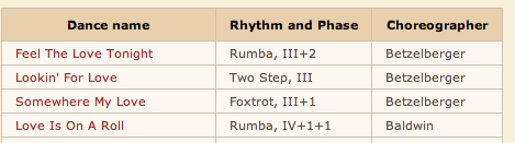
Using JavaScript, it is possible to send the data only once, without duplication, yet reformat the page on the client machine to fit whatever dimensions are available. My first attempt to use JavaScript (jQuery) in a responsive design is this one which shows a query into a database of dances.

As the page gets smaller the table changes from a standard horizontal grid format to a more vertical format. It does this by storing the table data in a JavaScript array and manipulating the DOM to have different HTML content when the page size changes. Using a technique like this, it is even possible to change the format altogether, for example, to eliminate the table at small sizes and use an unordered list or definition list instead, or just paragraphs.
On this Think Mobile site, I tried using JavaScript to change one of the tables on this alternate version of the Breakpoints page. The script actually reads the data in the table, and as the size gets smaller, it consolidates the second and third columns into one column, which still allows for a nice table display. The code is easy and executes quickly. You can view the JavaScript here.
There are some problems with the JavaScript approach. The main problem is that the window width in JavaScript is reported differently by different browsers. In particular, Webkit browsers and Mozilla browsers tend to report the window width about 16 pixels different. This is important if it is necessary to sync the JavaScript with the CSS media queries. For example, it is possible that the table might change from three columns to two at 480 pixels, the same time as the CSS moves the menus around. But it is possible that the table might change at 495 pixels instead on a different browser, while the CSS menus have not changed yet. This might not look so good on certain mobile devices.
CSS vs. JavaScript
The CSS version is about 500 bytes less, so it will take less time for the files to transfer, and there will be no overhead of executing JavaScript code after the files are received. The CSS selector that hides table column cells will take some time to execute.
It is a good idea to use PHP or some other scripting engine to put the table together. This PHP script shows how the data exists in only one place, but was written to both the CSS responsive table page and the JavaScript responsive table page using the same code base and database.
The JavaScript version is about 500 bytes longer and requires that the script be executed after the page is loaded. There are also problems with different browsers behaving differently. There still might be two advantages to using JavaScript. It is more versatile, so it may make it possible to create a wider variation of data formats efficiently. For example, it may be desirable to have more than two different ways to draw the table. It might even be desirable to eliminate the table altogether at small resolutions and use a list instead. In this case, JavaScript is probably the better way to go. Also, a table that has many columns might need a much more complicated adjustment than our simple example.
A second possible advantage to JavaScript is that if the data were very large, duplicating it in various ways (even using PHP) and showing and hiding large chunks of it in CSS might require much more HTML code, while the same thing could be accomplished with a bare minimum amount of HTML code and a small JavaScript module. So even though our CSS solution has smaller file size overall than our JavaScript solution, in some situations the JavaScript solution might be much smaller.