Mark’s Rules of User Interface
1. Don’t let the user make mistakes
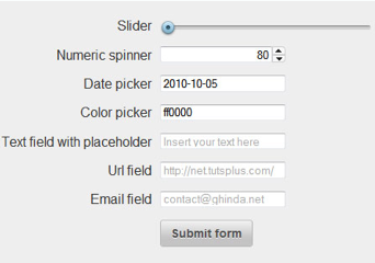
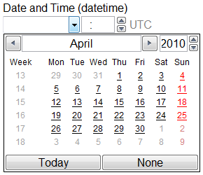
If you let the user enter a date, time, phone number, or even a simple number of items into a text field, you must be prepared to accept whatever they enter there. If they enter a date in a format that is not what you expected, that is your mistake, not theirs. If you can’t parse the date in any format they might enter it (including European vs. US formats, months in foreign language, etc.) then use a form that insures they will enter data that is usable for you. There are HTML5 form widgets suitable for entering email addresses, web URLs, numbers, dates, and colors.


Don’t make the user enter data into a text field when a better widget exists, possibly even as simple as an HTML menu or a couple of radio buttons or checkboxes.
Don’t forget to validate form data using JavaScript before returning the data to the server. If you use HTML5 widgets, much of this validation gets done for you automatically, but not all of it.
2. Let users enter data in a way they like and is suitable for their platform
I personally prefer to use a keyboard as much as possible because mousing hurts my wrists. Others prefer to mouse a lot and type little. Even those who (like me) prefer the physical keyboard may not enjoy the soft keyboard on a mobile platform.
So the best thing is to offer users who prefer to use a keyboard, and who are using a device that has a good keyboard, to use that keyboard as much as possible. This currently applies mostly to desktop computers, but most tablets now have a physical keyboard option, and many phones have such an option too.
At the same time, offer users of mobile devices as much capability as possible without using the keyboard. This means offering better ways of entering phone numbers, email addresses, URLs, and other text data. The current crop of predictive and correcting algorithms goes a long way, but more improvements could be made.
3. Give users widgets suitable to both the data and their platform

An HTML menu may be a way of putting away a lot of data in a very small space. But on a computer with a large monitor, an array of radio buttons may be more efficient. On a very small screen, an HTML menu with many choices (for example, 31 days of the month) may be longer than the screen height. In that case, a compact grid array may make more sense.
Make sure to use radio buttons when you allow only one choice, and check boxes when you allow more than one choice. Sometimes it’s not so clear, and sometimes one choice affects others. Use JavaScript or CSS to eliminate unusable choices in response to the first choices being made. For example, once they’ve chosen the month February, the days 30 and 31 become unavailable and should be hidden.
4. Make it fast
Much of user interface happens behind the scenes. A page or form that doesn’t do something within a couple of seconds will be deemed “unresponsive” by the user and abandoned. Your PHP and mySQL code must run fast. Even if you are a front-end programmer or a designer, you must insure that the back-end code is efficient. Hire someone to do that if you need to.
5. Don’t ask users to enter unnecessary information
Did you ever have to enter your password, credit card information and full address just to find out how much it will cost to ship a pair of shoes? Don’t make your site do that. All you need to know is their zip code. Anything else is information that is unnecessary to looking up the shipping or tax rates. Don’t make a user register in order to find these things out. I’ve seen some web sites that won’t even let you view the merchandise until you register with an email address, which of course they use to send you more offers every day.