Make A Series
Making Square Dance Figures
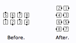
You can make a grid of boxes here. This form lets you select the number, color, and facing direction. Using this form, you can make graphics similar to the figures for 1/4 The Deucey.
User Interface Alternatives
This page is an experiment in finding the right balance of utility and usability for placing several SVG icons on the screen. It has four different options for choosing the number, color and facing direction of the icons:
- Use form menus to directly select the options.
- Use buttons to cycle through the options.
- Use a popup window to directly select the options.
- Use small buttons to directly select the options.
- There is another page that explores typing strings to indicate the options.
Directions: select a box first, then choose the options from the menus to apply to the selected box.
Directions: select a box first, then use the buttons to cycle through the options.
Directions: select a box. The picker window will come up automatically.
Directions: Select a box first. Then choose the number, direction, and color for that box.
Analysis of UI Alternatives
This table presents the number of clicks required to set the second row of the grid to the following SVG drawings:
| Device | Form Menus |
Cycle Buttons |
Popup Window |
Small Buttons |
Text |
|---|---|---|---|---|---|
| Samsung Galaxy S4 | 40 | 28 | 30 | 16 | 9 |
| iPad iOS 5.1.1 | 26 | 28 | 30 | 16 | 16 |
| iPhone iOS 7.0.4 | 37 | 28 | 30 | 16 | 16 |
| Mac Safari | 26 | 28 | 30 | 16 | 9 |
Since the button and popup mechanisms are not dependent on the operating system or browser implementation, the number of clicks is independent of the device being used.
Form Menus Interface
The native menus take many more clicks on the phone browsers
because they require extra scrolling up and down (which were counted as clicks) and extra
clicks on the [Done] button. But on the desktop and tablet browsers, they
scored at the low end of number of clicks required.
Cycle Buttons Interface
Cycle Buttons consistently required 28 clicks to draw a sequence of four checkers across the middle of the board. An analysis of the clicks:
- Click on a box
- to 6. Click
[+1]5 times from 0 to 5. - to 10. Click
[+Color]4 times from Black to Yellow. - Click on next box.
- Click
[+1]. - to 14. Click
[+Color]2 times from Yellow to Blue. - to 16. Click
[+Dir]2 times from Up to Down. - to 22. Repeat 11-16 except click
[-Color]2 times and[-Dir]2 times. - to 28. Repeat 11-16.
This method can require a lot of clicks if the desired value is halfway around the cycle. I thought it would provide the advantage of immediate feedback. But there is frequently an update delay on slow devices, which spoils the immediate feedback and causes user hesitation. Cycling a long way by trying to press the buttons quickly does not produce satisfying results.
There are up to 10 positions for the Cycle Buttons version to cycle through on each category. Therefore, to place just one token, the best case number of clicks is four total, if one can just click the box then one of each category of button. But the worse case is 15 clicks, if one has to cycle half way round (five clicks) in each of three categories. The average case would be in between, or about eight to nine clicks to place one token.
Popup Window Interface
The Popup Window interface consistently required 30 clicks to fill out a row of four tokens. The typical case is 8 clicks per token:
- Click on a box.
- Choose the
[Number]category (if necessary). - Choose a number.
- Choose the
[Color]category. - Choose a color.
- Choose the
[Direction]category. - Choose a direction.
- Click
[OK]
The number of clicks could be fewer if you don't need to change the number, color, or direction from the values chosen previously. On the other hand, the number of clicks could be more if you need to delete an old direction before adding a new one (two clicks) or if you need to add multiple directions (usually at most two clicks, if you get confused and have to fix a mistake, it could be more clicks).
This Popup Window method is probably a good interface for phones; but the Small Buttons interface may be even better. It is much friendlier than the Cycle Buttons version.
Small Buttons Interface
The Small Buttons interface consistently required 16 clicks to fill out a row of four tokens. The typical case is four clicks per token:
- Click on a box.
- Choose a number.
- Choose a color.
- Choose a direction.
Overall, this UI requires the fewest number of clicks. But it does have these drawbacks:
- The many buttons take up a lot of screen real estate.
- The buttons can be on the small side on some devices.
- The buttons are not organized as clearly as on the popup version.
Text Interface
The Text version always requires fewer clicks, but that is not necessarily friendlier because on the phones, the keyboard buttons are smaller targets than the buttons in the other UIs. Also, the iOS versions require more keystrokes/clicks because the numbers are on a separate palette and so the palettes must be swapped back and forth.
Conclusion
Overall, the Small Buttons method is probably best for devices that don't have a keyboard, and keying in the text is likely easiest on a computer that has a physical keyboard. But the other methods may be almost as good if the Small Buttons display takes up too much room on the screen.